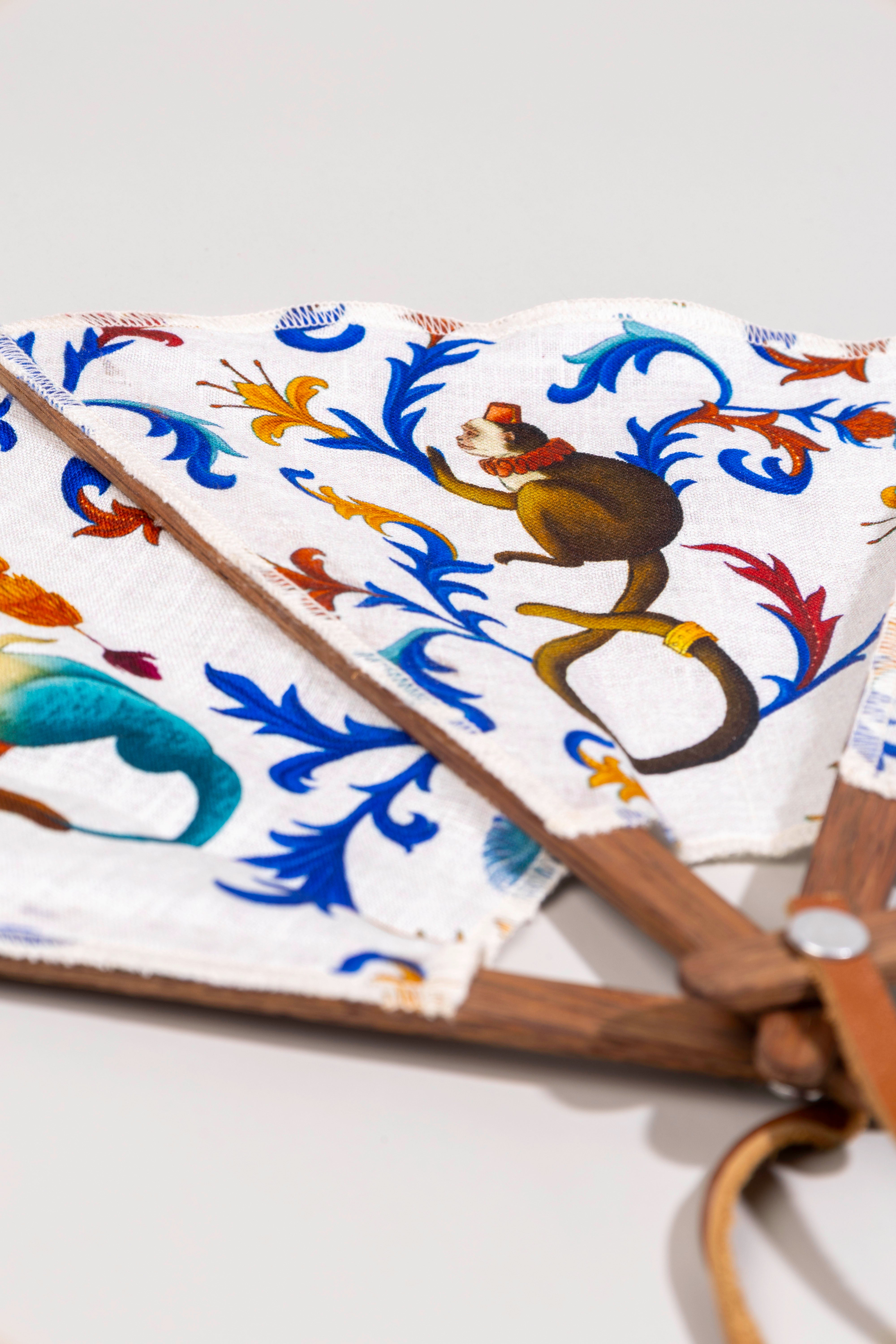
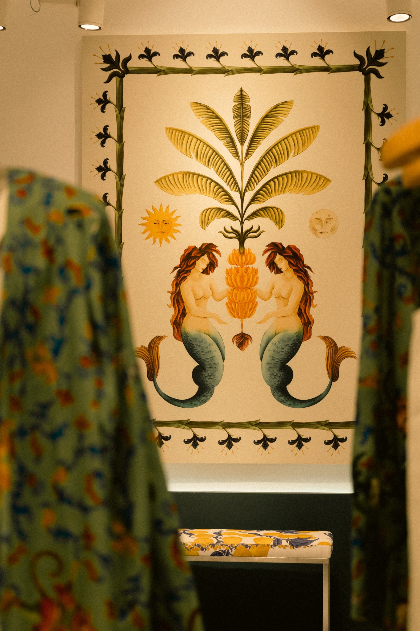
:host {
/* breakpoints: not-implemented / reference only */
/* --wrapped-breakpoint-xs: 320px; */
/* --wrapped-breakpoint-sm: 490px; */
/* --wrapped-breakpoint-md: 768px; */
/* --wrapped-breakpoint-lg: 1040px; */
/* --wrapped-breakpoint-xl: 1440px; */
--wrapped-thumbnail-position-start:
"media gift-dialog-header"
"media content"
"media gift-dialog-actions";
--wrapped-thumbnail-position-end:
"gift-dialog-header media"
"content media"
"gift-dialog-actions media";
--shadow-grid-template-areas: var(--wrapped-thumbnail-position-start);
/* border radius */
--shadow-border-radius-scale: 48;
--shadow-border-radius-xs: calc(var(--shadow-border-radius-scale, 65) / 100 * 1rem);
--shadow-border-radius-sm: calc(var(--shadow-border-radius-scale, 65) / 100 * 1.5rem);
--shadow-border-radius-base: calc(var(--shadow-border-radius-scale, 65) / 100 * 2.5rem);
--shadow-dialog-border-surface: rgba(0,0,0,0);
--shadow-border-width: 2px;
--shadow-outline-width: calc(var(--shadow-border-width) + 0.5px);
/* buttons */
--wrapped-hover-style-light: #ffffff;
--wrapped-hover-style-dark: #000000;
--shadow-hover-style: var(--wrapped-hover-style-dark, --wrapped-hover-style-light);
--shadow-primary-button-surface: #eca825;
--shadow-primary-button-surface--active: color-mix(in srgb, var(--shadow-primary-button-surface), var(--shadow-hover-style) 20%);
--shadow-primary-button-surface--hover: color-mix(in srgb, var(--shadow-primary-button-surface), var(--shadow-hover-style) 16%);
--shadow-primary-button-text-color: #ffffff;
--shadow-primary-button-text-color--active: color-mix(in srgb, var(--shadow-primary-button-text-color), var(--shadow-hover-style) 20%);
--shadow-primary-button-text-color--hover: color-mix(in srgb, var(--shadow-primary-button-text-color), var(--shadow-hover-style) 16%);
--shadow-primary-button-border-surface: rgba(0,0,0,0);
--shadow-primary-button-border-surface--active: transparent;
--shadow-primary-button-border-surface--hover: transparent;
--shadow-secondary-button-surface: #0000000f;
--shadow-secondary-button-surface--active: color-mix(in srgb, var(--shadow-secondary-button-surface), var(--shadow-hover-style) 20%);
--shadow-secondary-button-surface--hover: color-mix(in srgb, var(--shadow-secondary-button-surface), var(--shadow-hover-style) 16%);
--shadow-secondary-button-text-color: #cb2b2b;
--shadow-secondary-button-text-color--active: color-mix(in srgb, var(--shadow-secondary-button-text-color), var(--shadow-hover-style) 20%);
--shadow-secondary-button-text-color--hover: color-mix(in srgb, var(--shadow-secondary-button-text-color), var(--shadow-hover-style) 16%);
--shadow-secondary-button-border-surface: rgba(0,0,0,0);
--shadow-secondary-button-border-surface--active: transparent;
--shadow-secondary-button-border-surface--hover: transparent;
/* do not change the root text size */
--shadow-font-size: 16px;
/* text and fonts */
--shadow-font-family: var(--wrapped-font-family, inherit);
--shadow-font-scale: calc(100 / 100);
--shadow-font-size-sm: clamp(12px, calc(14px * var(--shadow-font-scale)), 16px);
--shadow-font-size-base: clamp(12px, calc(16px * var(--shadow-font-scale)), 20px);
--shadow-font-size-lg: clamp(16px, calc(24px * var(--shadow-font-scale)), 28px);
--shadow-font-weight-base: var(--wrapped-font-weight-base, 400);
--shadow-font-weight-md: 500;
--shadow-font-weight-lg: 600;
--shadow-letter-spacing: var(--wrapped-letter-spacing, normal);
--shadow-line-height-base: 1.5em;
/* transitions */
--shadow-transition-duration: 0.1s;
--shadow-spinner-duration: 0.7s;
/* disabled */
--shadow-disabled-opacity-sm: 0.16;
--shadow-disabled-opacity: 0.32;
--shadow-disabled-opacity-md: 0.4;
--shadow-disabled-opacity-lg: 0.64;
/* precalculated percentages for color-mix */
--shadow-disabled-opacity-percent: 32%;
--shadow-disabled-opacity-sm-percent: 16%;
--shadow-disabled-opacity-md-percent: 40%;
--shadow-disabled-opacity-lg-percent: 64%;
--shadow-disabled-cursor: not-allowed;
/* form elements */
--shadow-form-element-surface: #ffffff;
--shadow-form-element-surface--disabled: color-mix(in srgb, var(--shadow-form-element-surface) var(--shadow-disabled-opacity-percent), var(--shadow-secondary-text-color) 8%);
--shadow-form-element-border-color: #0000000f;
--shadow-form-element-border-color--active: color-mix(in srgb, var(--shadow-form-element-border-color), white 83%);
--shadow-form-element-border-color--disabled: color-mix(in srgb, var(--shadow-form-element-border-color) var(--shadow-disabled-opacity-percent), var(--shadow-secondary-text-color) 8%);
--shadow-form-element-text-color: #263c7b;
--shadow-form-element-text-color--disabled: color-mix(in srgb, var(--shadow-form-element-text-color), var(--shadow-secondary-text-color) 8%);
--shadow-form-element-placeholder-text-color: color-mix(in srgb, var(--shadow-form-element-text-color) var(--shadow-disabled-opacity-percent), transparent);
--shadow-form-element-placeholder-text-color--disabled: color-mix(in srgb, var(--shadow-form-element-text-color) var(--shadow-disabled-opacity-percent), var(--shadow-secondary-text-color) 8%);
--shadow-form-element-selection-color: #f3f3f3;
--shadow-form-element-selection-color--active: color-mix(in srgb, var(--shadow-form-element-selection-color), var(--shadow-hover-style) 40%);
--shadow-form-element-selection-color--hover: color-mix(in srgb, var(--shadow-form-element-selection-color), var(--shadow-hover-style) 32%);
/* primary colors */
--shadow-primary-surface: #ffffff;
--shadow-primary-text-color: #263c7b;
--shadow-primary-text-color--hover: color-mix(in srgb, var(--shadow-primary-text-color), var(--shadow-hover-style) 32%);
/* secondary colors */
--shadow-secondary-surface: #f3f3f3;
--shadow-secondary-text-color: #0e1e3b;
--shadow-secondary-text-color--disabled: color-mix(in srgb, var(--shadow-secondary-text-color) var(--shadow-disabled-opacity-lg-percent), var(--shadow-secondary-text-color) 8%);
/* Typography customizations */
--shadow-button-text-transform: var(--wrapped-button-text-transform, none);
--shadow-button-letter-spacing: var(--wrapped-button-letter-spacing, var(--shadow-letter-spacing, normal));
--shadow-button-font-style: var(--wrapped-button-font-style, normal);
/* spacing */
--wrapped-spacing-scale-base: 1;
--wrapped-spacing-scale-less: 0.75;
--wrapped-spacing-scale-more: 1.166;
--shadow-spacing-scale: var(--wrapped-spacing-scale-base, 1);
--shadow-spacing-fixed: 4px;
--shadow-spacing-base: clamp(12px, calc(16px * var(--shadow-spacing-scale)), 24px);
--shadow-spacing-lg: clamp(16px, calc(24px * var(--shadow-spacing-scale)), 28px);
--shadow-spacing-sm: clamp(8px, calc(12px * var(--shadow-spacing-scale)), 14px);
--shadow-spacing-xs: clamp(6px, calc(8px * var(--shadow-spacing-scale)), 10px);
/* shadows */
--shadow-shadow-blur: 1.5rem;
--shadow-shadow-color: rgba(0, 0, 0, 0.25);
--shadow-shadow-offset: 0.75rem;
/* default styles */
all: revert;
box-sizing: border-box;
cursor: default;
display: block;
font-family: var(--shadow-font-family);
font-size: var(--shadow-font-size);
line-height: var(--shadow-line-height-base);
letter-spacing: var(--shadow-letter-spacing);
margin-block-start: var(--shadow-spacing-xs);
margin-block-end: var(--shadow-spacing-xs);
text-align: start;
width: -webkit-fill-available;
white-space: normal;
}
*,
*::before,
*::after {
box-sizing: inherit;
}
/* gift block launcher */
gift-block-launcher {
display: flex;
flex-direction: column;
gap: var(--shadow-spacing-xs);
& gift-block-visibility-notice {
display: block;
font-family: var(--shadow-font-family);
font-size: smaller;
font-weight: var(--shadow-font-weight-base);
font-style: var(--shadow-button-font-style);
letter-spacing: var(--shadow-button-letter-spacing);
padding: 0 var(--shadow-spacing-sm);
text-transform: var(--shadow-button-text-transform);
width: 100%;
}
}
.gift-block__launcher {
background-color: var(--wrapped-launcher-button-surface, var(--shadow-primary-button-surface));
border-color: var(--wrapped-launcher-button-border-surface, var(--shadow-primary-button-border-surface));
border-width: var(--wrapped-launcher-button-border-width, var(--shadow-border-width));
border-radius: var(--wrapped-launcher-button-border-radius, var(--shadow-border-radius-sm));
border-style: solid;
color: var(--shadow-primary-button-text-color);
padding: var(--shadow-spacing-sm);
font-family: var(--shadow-font-family);
font-size: var(--shadow-font-size-base);
font-weight: var(--shadow-font-weight-base);
font-style: var(--shadow-button-font-style);
letter-spacing: var(--shadow-button-letter-spacing);
max-width: var(--wrapped-launcher-button-max-width, 500px);
text-transform: var(--shadow-button-text-transform);
width: 100%;
&:hover {
cursor: pointer;
background-color: var(--shadow-primary-button-surface--hover);
border-color: var(--shadow-primary-button-border-surface--hover);
}
&:active {
background-color: var(--shadow-primary-button-surface--active);
border-color: var(--shadow-primary-button-border-surface--active);
}
&:focus,
&:focus-visible {
outline: none;
}
&[with-checkmark] {
position: relative;
display: inline-flex;
align-items: center;
gap: var(--shadow-spacing-fixed);
& .icon-wrapper {
display: flex;
flex-shrink: 0;
}
& .button-content {
justify-content: var(--wrapped-launcher-button-content-justify-content, space-between);
}
&[with-gift-options] {
.checkmark-icon {
display: block;
/* animation: unblur calc(var(--shadow-transition-duration) * 3) ease forwards; */
}
}
}
&[variant="link"] {
background: none;
border: none;
color: var(--shadow-primary-text-color);
font-size: var(--shadow-font-size-base);
font-weight: var(--shadow-font-weight-base);
font-style: var(--shadow-button-font-style);
letter-spacing: var(--shadow-button-letter-spacing);
text-transform: var(--shadow-button-text-transform);
text-decoration: none;
margin-inline-start: -0.25rem;
padding: 0;
width: auto;
&:hover {
cursor: pointer;
color: var(--shadow-primary-text-color--hover);
text-decoration: underline;
}
&[with-checkmark] {
padding-left: 0;
text-align: start;
word-break: keep-all;
}
& .button-content {
flex-direction: row;
justify-content: flex-start;
}
}
& .button-content {
display: inline-flex;
align-items: center;
gap: var(--shadow-spacing-fixed);
flex-direction: row-reverse;
justify-content: var(--wrapped-launcher-button-content-justify-content, center);
width: 100%;
& .label {
text-align: start;
}
}
& .icon-wrapper {
display: none;
align-items: center;
justify-content: center;
width: 1.5em;
height: 1.5em;
svg {
fill: currentColor;
height: 100%;
width: 100%;
}
.checkmark-icon {
display: none;
}
}
}
.gift-block__launcher:disabled,
.gift-block__launcher[orders-limit-reached] {
cursor: var(--shadow-disabled-cursor);
opacity: var(--shadow-disabled-opacity);
pointer-events: none;
&[with-checkmark] {
.icon-wrapper {
opacity: var(--shadow-disabled-opacity-md);
}
}
}
/* gift block modal */
.gift-block-modal {
background-color: var(--shadow-primary-surface);
border: none;
border-radius: var(--shadow-border-radius-base);
box-shadow: 0 var(--shadow-shadow-offset) var(--shadow-shadow-blur) var(--shadow-shadow-color);
outline: var(--shadow-border-width) solid var(--shadow-dialog-border-surface);
padding: 0;
}
.gift-block-modal::backdrop {
background-color: rgba(156, 163, 175, 0.75);
}
.gift-block-modal:focus,
.gift-block-modal:focus-visible {
outline: var(--shadow-border-width) solid var(--shadow-dialog-border-surface);
}
@media (max-width: 768px) {
.gift-block-modal {
max-height: calc(100% - var(--shadow-spacing-sm));
max-width: calc(100% - var(--shadow-spacing-sm));
overscroll-behavior: contain;
}
}
/* gift block modal layout */
.gift-block-modal-layout {
display: grid;
grid-template-areas: var(--shadow-grid-template-areas);
grid-template-columns: 1fr 1fr;
grid-template-rows: auto 1fr auto;
max-height: 80dvh;
max-width: 80dvw;
overflow: hidden;
}
/* Collapse to 1-column layout if media is hidden */
.gift-block-modal-layout:has(section#media[hidden]),
.gift-block-modal-layout:has(section#media.with-media-inline),
.gift-block-modal-layout:not(:has(section#media)),
.gift-block-modal-layout:not(:has(section#media img)) {
grid-template-areas:
"gift-dialog-header"
"content"
"gift-dialog-actions";
grid-template-columns: 1fr;
grid-template-rows: auto 1fr auto;
section#media {
display: none;
}
}
gift-dialog-header {
align-items: flex-start;
background-color: var(--shadow-primary-surface);
display: flex;
flex-direction: row;
gap: var(--shadow-spacing-fixed);
grid-area: gift-dialog-header;
justify-content: space-between;
padding: var(--shadow-spacing-lg);
position: sticky;
top: 0;
z-index: 1;
& h1 {
color: var(--shadow-primary-text-color);
font-family: var(--wrapped-header-font-family, var(--shadow-font-family));
font-size: var(--shadow-font-size-lg);
font-weight: var(--shadow-font-weight-md);
line-height: 1.25em;
margin: 0;
}
/* dismiss button styles */
& button {
background-color: color-mix(in srgb, var(--shadow-secondary-text-color) 8%, transparent);
color: var(--shadow-secondary-text-color);
border-radius: var(--shadow-border-radius-xs);
font-size: var(--shadow-font-size-sm);
font-weight: var(--shadow-font-weight-lg);
font-style: var(--shadow-button-font-style);
letter-spacing: var(--shadow-button-letter-spacing);
text-transform: var(--shadow-button-text-transform);
width: 2.25em;
height: 2.25em;
min-width: 2.25em;
min-height: 2.25em;
outline: none;
border: 0;
cursor: pointer;
transition: background-color var(--shadow-transition-duration) ease,
color var(--shadow-transition-duration) ease;
&:hover {
background-color: color-mix(in srgb, var(--shadow-secondary-text-color) 6%, var(--shadow-hover-style) 12%);
}
&:active {
background-color: color-mix(in srgb, var(--shadow-secondary-text-color) 16%, var(--shadow-hover-style) 16%);
}
&:disabled {
pointer-events: none;
opacity: var(--shadow-disabled-opacity);
}
}
}
gift-dialog-actions {
align-items: flex-end;
background-color: var(--shadow-primary-surface);
bottom: 0;
display: flex;
flex-direction: column;
gap: var(--shadow-spacing-sm);
grid-area: gift-dialog-actions;
overscroll-behavior: contain;
position: sticky;
padding: var(--shadow-spacing-lg);
z-index: 1;
& button {
border-radius: var(--shadow-border-radius-sm);
border-width: var(--shadow-border-width);
border-style: solid;
cursor: pointer;
font-family: var(--wrapped-actions-button-font-family, var(--shadow-font-family));
font-size: var(--shadow-font-size-base);
font-weight: var(--shadow-font-weight-md);
font-style: var(--shadow-button-font-style);
letter-spacing: var(--shadow-button-letter-spacing);
text-transform: var(--shadow-button-text-transform);
padding: var(--shadow-spacing-sm);
position: relative;
width: 100%;
transition: background-color var(--shadow-transition-duration) ease,
border-color var(--shadow-transition-duration) ease,
color var(--shadow-transition-duration) ease,
opacity var(--shadow-transition-duration) ease;
&.primary {
background-color: var(--shadow-primary-button-surface);
border-color: var(--shadow-primary-button-border-surface);
color: var(--shadow-primary-button-text-color);
display: flex;
align-items: center;
justify-content: center;
.button-content {
display: flex;
align-items: center;
justify-content: center;
width: 100%;
}
.label {
flex: 0 1 auto;
min-width: 0;
text-align: center;
}
.label.out-of-stock {
display: none;
}
.icon-wrapper {
width: 0em;
height: 1.25em;
}
&:hover {
background-color: var(--shadow-primary-button-surface--hover);
border-color: var(--shadow-primary-button-border-surface--hover);
color: var(--shadow-primary-button-text-color--hover);
}
&:active {
background-color: var(--shadow-primary-button-surface--active);
border-color: var(--shadow-primary-button-border-surface--active);
color: var(--shadow-primary-button-text-color--active);
}
&[loading] {
background-color: var(--shadow-primary-button-surface--active);
border-color: var(--shadow-primary-button-border-surface--active);
color: var(--shadow-primary-button-text-color--active);
pointer-events: none;
.button-content {
opacity: 0;
}
}
}
&.secondary {
background-color: var(--shadow-secondary-button-surface);
border-color: var(--shadow-secondary-button-border-surface);
color: var(--shadow-secondary-button-text-color);
display: flex;
align-items: center;
justify-content: center;
.button-content {
display: flex;
align-items: center;
justify-content: center;
gap: var(--shadow-spacing-fixed);
width: 100%;
}
.label {
flex: 0 1 auto;
min-width: 0;
text-align: center;
}
.icon-wrapper {
--icon-stroke-width: 1.5px;
flex: 0 0 auto;
display: flex;
align-items: center;
justify-content: center;
svg {
width: 1.25em;
height: 1.25em;
stroke-width: var(--icon-stroke-width);
}
.remove-icon-top, .remove-icon-bottom {
transition: transform var(--shadow-transition-duration) ease-in-out;
}
}
&:hover {
background-color: var(--shadow-secondary-button-surface--hover);
border-color: var(--shadow-secondary-button-border-surface--hover);
color: var(--shadow-secondary-button-text-color--hover);
.icon-wrapper {
.remove-icon-top {
transform: translate(calc(-1 * var(--icon-stroke-width)), var(--icon-stroke-width)) rotate(-15deg);
}
.remove-icon-bottom {
transform: translateY(var(--icon-stroke-width));
}
}
}
&:active {
background-color: var(--shadow-secondary-button-surface--active);
border-color: var(--shadow-secondary-button-border-surface--active);
.icon-wrapper {
transition: filter var(--shadow-transition-duration) ease-in-out;
}
}
&[hidden] {
display: none;
}
&[loading] {
background-color: var(--shadow-secondary-button-surface--active);
border-color: var(--shadow-secondary-button-border-surface--active);
color: var(--shadow-secondary-button-text-color--active);
pointer-events: none;
.button-content {
opacity: 0;
}
.spinner .svg-wrapper svg {
fill: var(--shadow-secondary-button-text-color--active);
}
}
}
&:disabled {
cursor: var(--shadow-disabled-cursor);
opacity: var(--shadow-disabled-opacity);
pointer-events: none;
.button-content {
pointer-events: none;
opacity: calc(var(--shadow-disabled-opacity) * 1.5);
}
}
/* spinner styles */
.spinner {
opacity: 0;
position: absolute;
top: 50%;
left: 50%;
transform: translate(-50%, -50%);
& .svg-wrapper svg {
animation: spin var(--shadow-spinner-duration) cubic-bezier(0, 0, 1, 1) infinite;
fill: var(--shadow-primary-button-text-color);
height: 1.5em;
}
& [role="status"] {
visibility: hidden;
opacity: 0;
position: absolute;
top: 0;
left: 0;
width: 100%;
height: 100%;
}
}
&[loading] {
pointer-events: none;
.spinner {
opacity: 1;
}
}
}
&:has(button[loading]:not([hidden])) {
& button {
pointer-events: none;
opacity: 0.8;
}
}
&:is([out-of-stock]) {
& button.primary {
pointer-events: none !important;
opacity: 0.6 !important;
& .label {
display: none;
}
& .label.out-of-stock {
display: block;
}
}
}
}
gift-dialog-content {
display: contents;
}
section#media {
align-self: stretch;
background-color: var(--shadow-secondary-surface);
grid-area: media;
grid-row: 1 / 4;
height: 100%;
padding: var(--shadow-spacing-lg);
position: sticky;
top: 0;
transition: order var(--shadow-transition-duration) ease,
width var(--shadow-transition-duration) ease;
&.with-media-cover {
& img {
height: 100%;
}
}
&.with-media-fill {
padding: 0;
& img {
border-radius: 0;
height: 100%;
}
}
& shopify-media {
& img {
border-radius: var(--shadow-border-radius-sm);
width: 100%;
height: auto;
}
}
}
section#content {
grid-area: content;
background-color: var(--shadow-primary-surface);
overflow-y: auto;
overscroll-behavior: contain;
scrollbar-width: thin;
-webkit-overflow-scrolling: touch;
padding: var(--shadow-spacing-lg);
padding-bottom: 0;
padding-top: 0;
position: relative; /* important to prevent content shifting when changing variants */
align-items: stretch;
display: flex;
flex-direction: column;
justify-content: flex-start;
gap: var(--shadow-spacing-lg);
transition: order var(--shadow-transition-duration) ease;
@media (max-width: 768px) {
& > *:first-child:not(:only-child) {
margin-top: unset;
}
}
/* gift product details */
& .gift-product {
display: flex;
flex-direction: column;
gap: var(--shadow-spacing-base);
}
& .gift-product-header {
--wrapped-thumbnail-position-start: row;
--wrapped-thumbnail-position-end: row-reverse;
align-items: center;
display: flex;
flex-direction: var(--wrapped-thumbnail-position-start);
flex-wrap: wrap;
row-gap: var(--shadow-spacing-base);
column-gap: var(--shadow-spacing-sm);
}
& .gift-product-content {
display: flex;
flex: 1 1 50%;
flex-direction: column;
gap: var(--shadow-spacing-xs);
}
& .gift-product-media {
display: flex;
align-items: center;
&:has(shopify-media) {
--shadow-inline-media-max-size: 40px;
--shadow-inline-media-size: clamp(40px, 40px, var(--shadow-inline-media-max-size));
border-radius: var(--shadow-border-radius-sm);
height: var(--shadow-inline-media-size);
width: var(--shadow-inline-media-size);
overflow: hidden;
margin-inline-start: auto;
margin-inline-end: auto;
}
& shopify-media {
& img {
border-radius: var(--shadow-border-radius-sm);
width: 100%;
height: auto;
}
}
}
& .gift-product-title {
color: var(--shadow-primary-text-color);
display: var(--wrapped-gift-product-title-display, block);
font-size: var(--shadow-font-size-base);
font-weight: var(--shadow-font-weight-md);
margin: 0;
}
& .gift-product-pricing {
display: flex;
gap: var(--shadow-spacing-xs);
margin: 0;
font-weight: var(--shadow-font-weight-base);
font-size: clamp(12px, calc(var(--shadow-font-size-base) * 0.94), 18px);
line-height: 1em;
}
& .gift-product-price {
color: var(--shadow-secondary-text-color);
}
& .gift-product-price--compare {
color: var(--shadow-secondary-text-color);
text-decoration: line-through;
opacity: var(--shadow-disabled-opacity);
}
& .gift-product-description {
font-weight: var(--shadow-font-weight-base);
color: var(--shadow-secondary-text-color);
font-size: clamp(12px, calc(var(--shadow-font-size-base) * 0.94), 18px);
line-height: 1.5em;
& shopify-data {
& :first-child {
margin-top: 0;
}
& :last-child {
margin-bottom: 0;
}
& ul {
padding-left: var(--shadow-spacing-lg);
}
}
}
/* gift messaging fields */
& gift-dialog-message {
display: flex;
flex-direction: row;
flex-wrap: wrap;
gap: var(--shadow-spacing-base);
}
& .option-group {
display: flex;
flex-direction: column;
gap: var(--shadow-spacing-xs);
flex: 0 0 100%;
@media (min-width: 768px) {
&:has(input[id="receiver-input"]),
&:has(input[id="sender-input"]) {
flex: 1 1 0%;
}
}
&.option-group-disabled {
cursor: var(--shadow-disabled-cursor);
pointer-events: none;
opacity: var(--shadow-disabled-opacity-md);
transition: background-color var(--shadow-transition-duration) ease,
color var(--shadow-transition-duration) ease;
& .message-field {
background-color: var(--shadow-form-element-surface--disabled);
color: transparent;
outline-color: var(--shadow-form-element-border-color--disabled);
pointer-events: none;
}
}
&.option-group-hidden {
display: none;
}
& label {
font-size: var(--shadow-font-size-sm);
font-weight: var(--shadow-font-weight-base);
color: var(--shadow-secondary-text-color);
line-height: 1em;
}
& .message-field {
background-color: var(--shadow-form-element-surface);
color: var(--shadow-form-element-text-color);
width: 100%;
padding: var(--shadow-spacing-sm);
border: none;
border-radius: var(--shadow-border-radius-sm);
font-family: var(--shadow-font-family);
font-size: var(--shadow-font-size-base);
outline: var(--shadow-border-width) solid var(--shadow-form-element-border-color);
min-height: 42px;
}
& .message-field:active,
& .message-field:focus,
& .message-field:focus-within,
& .message-field:focus-visible {
outline-color: var(--shadow-form-element-selection-color);
outline-width: var(--shadow-outline-width);
}
& .message-field::placeholder {
color: var(--shadow-form-element-placeholder-text-color);
}
& textarea.message-field {
min-height: 100px;
resize: vertical;
}
& .counter {
color: var(--shadow-secondary-text-color);
font-size: var(--shadow-font-size-sm);
line-height: normal;
}
}
}
/* shopify variant selector */
shopify-variant-selector {
font-size: var(--shadow-font-size-sm);
width: 100%;
&[variants-count="1"] {
display: none;
}
}
shopify-variant-selector::part(form) {
gap: var(--shadow-spacing-base);
}
shopify-variant-selector::part(radio) {
background-color: var(--shadow-form-element-surface);
color: var(--shadow-form-element-text-color);
border: none;
border-radius: var(--shadow-border-radius-sm);
font-size: var(--shadow-font-size-base);
font-weight: var(--shadow-font-weight-base);
outline: var(--shadow-border-width) solid var(--shadow-form-element-border-color);
padding: calc(var(--shadow-spacing-sm) * 0.5) var(--shadow-spacing-base);
transition: color var(--shadow-transition-duration) ease,
outline-color var(--shadow-transition-duration) ease,
outline-width var(--shadow-transition-duration) ease;
}
shopify-variant-selector::part(radio):active {
outline-color: var(--shadow-form-element-selection-color--active);
outline-width: var(--shadow-outline-width);
}
shopify-variant-selector::part(radio):hover {
outline-color: var(--shadow-form-element-selection-color--hover);
}
shopify-variant-selector::part(radio-disabled) {
background-color: var(--shadow-form-element-surface--disabled);
color: var(--shadow-form-element-text-color--disabled);
opacity: var(--shadow-disabled-opacity); /* do not transition opacity - it causes a flash when changing variants */
outline-color: var(--shadow-form-element-border-color--disabled);
pointer-events: none;
}
shopify-variant-selector::part(radio-selected) {
outline-color: var(--shadow-form-element-selection-color);
outline-width: var(--shadow-outline-width);
pointer-events: none;
}
shopify-variant-selector::part(select) {
color: var(--shadow-form-element-text-color);
border: none;
border-radius: var(--shadow-border-radius-sm);
font-family: var(--shadow-font-family);
font-size: var(--shadow-font-size-base);
font-weight: var(--shadow-font-weight-base);
margin-top: var(--shadow-spacing-xs);
width: 100%;
max-width: 100%;
padding: var(--shadow-spacing-sm);
padding-right: calc(var(--shadow-spacing-sm) + 1.5rem);
outline: var(--shadow-border-width) solid var(--shadow-form-element-border-color);
appearance: none;
-webkit-appearance: none;
-moz-appearance: none;
background-color: var(--shadow-form-element-surface);
background-image: url("data:image/svg+xml,%3Csvg xmlns='http://www.w3.org/2000/svg' viewBox='0 0 20 20'%3E%3Cpath fill='currentColor' fill-rule='evenodd' d='M6.24 8.2a.75.75 0 0 1 1.06.04l2.7 2.908 2.7-2.908a.75.75 0 1 1 1.1 1.02l-3.25 3.5a.75.75 0 0 1-1.1 0l-3.25-3.5a.75.75 0 0 1 .04-1.06Z'/%3E%3C/svg%3E");
background-repeat: no-repeat;
background-position: right 0.5rem center;
background-size: 1em 1em;
}
shopify-variant-selector::part(select):focus,
shopify-variant-selector::part(select):focus-visible {
outline-color: var(--shadow-form-element-selection-color);
outline-width: var(--shadow-outline-width);
}
shopify-variant-selector::part(color-swatch) {
border: none;
outline: var(--shadow-border-width) solid rgba(0, 0, 0, .1);
transition: color var(--shadow-transition-duration) ease,
outline-color var(--shadow-transition-duration) ease,
outline-width var(--shadow-transition-duration) ease;
}
shopify-variant-selector::part(color-swatch):active {
outline-color: var(--shadow-form-element-selection-color--active);
outline-width: var(--shadow-outline-width);
}
shopify-variant-selector::part(color-swatch):hover {
outline-color: var(--shadow-form-element-selection-color--hover);
}
shopify-variant-selector::part(color-swatch-selected) {
outline-color: var(--shadow-form-element-selection-color);
outline-width: var(--shadow-outline-width);
}
shopify-variant-selector::part(color-swatch-selected):after {
content: unset;
}
shopify-variant-selector::part(color-swatch-label) {
color: var(--shadow-secondary-text-color);
}
shopify-variant-selector::part(color-swatch-disabled) {
opacity: var(--shadow-disabled-opacity); /* do not transition opacity - it causes a flash when changing variants */
pointer-events: none;
}
shopify-variant-selector::part(label) {
color: var(--shadow-secondary-text-color);
display: inline-block;
font-size: var(--shadow-font-size-sm);
font-weight: var(--shadow-font-weight-base);
line-height: 1em;
margin-bottom: calc(var(--shadow-spacing-sm) - 6px);
}
/* media queries */
/* md - and above */
@media (min-width: 768px) {
:host {
--shadow-section-max-width: 420px;
}
gift-dialog-content > section {
min-width: var(--shadow-section-max-width);
max-width: var(--shadow-section-max-width);
}
gift-dialog-header,
gift-dialog-actions {
min-width: var(--shadow-section-max-width);
max-width: var(--shadow-section-max-width);
}
}
/* md - and below */
@media (max-width: 768px) {
:host {
--shadow-section-max-width: 390px;
}
gift-dialog-content > section {
min-width: var(--shadow-section-max-width);
max-width: var(--shadow-section-max-width);
}
gift-dialog-header,
gift-dialog-actions {
min-width: var(--shadow-section-max-width);
max-width: var(--shadow-section-max-width);
padding: var(--shadow-spacing-base);
}
.gift-block-modal-layout {
grid-template-areas:
"gift-dialog-header"
"media"
"content"
"gift-dialog-actions";
grid-template-columns: 1fr;
grid-template-rows: auto auto 1fr auto;
max-height: calc(100dvh - var(--shadow-spacing-base));
max-width: 100dvw;
}
gift-dialog-content {
display: grid;
grid-template-areas:
"media"
"content";
grid-template-columns: 1fr;
grid-template-rows: auto 1fr;
overflow-y: auto;
overscroll-behavior: contain;
scrollbar-width: thin;
-webkit-overflow-scrolling: touch;
}
section#media {
background: none;
grid-row: auto;
position: relative;
padding: 0;
& shopify-media {
& img {
border-radius: unset;
min-height: var(--shadow-section-max-width);
max-height: var(--shadow-section-max-width);
}
}
}
section#content {
overflow-y: unset;
padding: var(--shadow-spacing-base);
&.with-media-inline {
padding-top: 0;
}
& .gift-product-media {
&:has(shopify-media) {
--shadow-inline-media-max-size: 330px;
}
}
}
}
/* sm - and below */
@media (max-width: 480px) {
:host {
--shadow-section-max-width: 100%;
}
section#media {
& shopify-media {
& img {
border-radius: unset;
min-height: 350px;
max-height: 350px;
}
}
}
}
/* animations for loaders */
@keyframes spin {
100% { transform: rotate(1turn); }
}
@keyframes unblur {
from { filter: blur(2px); }
to { filter: blur(0px); }
}
Skip to content
It’s always about the fit
¿Looking for a new suit?
We know that choosing the right cut, color, material, and size can be quite a challenge. But we have some golden rules that you can keep in mind the next time you visit us and you're not sure what you're looking for.
Stick with the classics Opting for base colors like blue or black, a classic straight cut, and traditional materials like cotton or wool are the right choice for you if you plan on wearing the suit for various occasions. It's versatile and will last you for years.
If it's your first suit, it's important to choose something basic. We don't recommend going for trendy prints or colors. Remember that a simple suit is a must-have in your wardrobe and will save you in the future. However, if you're looking for something more in line with your personal style and it's not your first suit, you can find colorful and patterned options in cotton fibers in our latest collection.
Always try on the complete suit Here, the most important thing to consider is the fit of the suit.
And yes, ideally, you should try it on complete with a shirt and dress shoes. Trying on the total look is a golden rule when visiting our store. We will determine your body type and recommend the cut that suits you best, as well as the colors and any possible alterations our tailor needs to make to ensure it fits you perfectly. However, the "perfect fit" doesn't mean the suit should fit your body like a mirror. Remember that comfort is paramount and being overly tight can be a problem. The fit lies in the ideal point, neither too tight nor too loose. Think about your comfort and the occasion of use.
Ask any questions you have to ask A common mistake is to assume or overlook frequently asked questions such as the occasion for which you're buying the suit. Remember that there are dress codes, and many can be strict, so you might be missing something in your purchase. Ask about other possible combinations that you can adapt to your new suit, colors that suit you better, and be honest during the fitting process about whether you feel comfortable or not. Part of our guidance is not only finding the best option but also ensuring that comfort and good taste prevail in your choice. So feel free to ask as many questions as you deem necessary.
Contact us and receive assistance.